
Key facts
- Conversion rate rise from 0.5% to 1.5% triples inquiries from 1 to 3 with 200 visitors per traffic analysis
- Website visitors take approximately 5 seconds to determine if an offering matches their search per Leadpeak data
- Over half of all purchase decisions begin with Google search according to website analysis
- Foundry CRO reports average conversion lift of +38% in first 90 days through dedicated testing
- Time to first live experiment can be as fast as 7 days from kickoff per Foundry CRO
- Addressing readers as individuals rather than a group increases engagement effectiveness per digital advocacy principles
WANT RESULTS LIKE THIS?
Imagine a system doing all of this for your local business — every day, without you.
We build local businesses a custom website with a team of AI behind it: every lead captured and followed up, new content published monthly,customers finding you on Google — live in 7 days.
- 85+ pages at launch
- Every lead followed up, automatically
- Your whole business on one screen
Two Clicks, Two Very Different Jobs
Visitors decide in about 5 seconds whether a site matches their search, yet most small business websites blur the line between CTA buttons and hyperlinks — using them interchangeably and losing leads. That confusion costs real revenue because website traffic analysis shows increasing conversion rate from 0.5% to 1.5% with 200 visitors triples inquiries from 1 to 3.
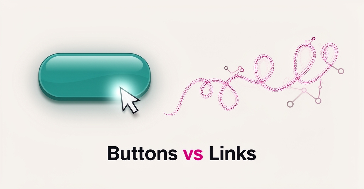
Buttons and links are not styling choices. They carry different intent, and AI-powered design treats them differently when it guides users toward action.
A CTA button commits the visitor to one primary action. It is visual, contained, and directive. In AI-powered website design, buttons are the decision points the system wants to be explicit about — book now, get a quote, start the build. The design signals finality and priority, which helps the AI prioritize follow-up and capture.
A hyperlink quietly guides exploration. It supports curiosity without demanding commitment. Links keep the visitor in learning mode, scanning service details, reading comparisons, or checking proof. AI content engines use them to build topical clusters and keep session time healthy while the primary action stays clear.
The difference matters because conversion-optimized design is critical for turning website traffic into revenue, and visibility alone is insufficient. Over half of all purchase decisions begin with Google search, so the first impression has to convert fast.
In practice for AI Business Sites builds, the distinction is operational:
- Buttons drive the primary conversion path the AI monitors and follows up on automatically
- Links support discovery and SEO depth, feeding the content engine’s internal linking and topical authority
- Mixing the two dilutes intent and confuses the AI’s lead capture and routing logic
When the system is trained to know which element means “act now” versus “learn more,” the assistant can respond appropriately. A click on a button triggers instant response, CRM creation, and owner alert. A link click is logged for behavior signals and nurturing.
Clear separation protects the 5-second decision window. Buttons own commitment. Links own exploration. Keeping that boundary sharp is how AI-powered sites turn fast judgments into booked calls and captured leads without adding friction.
The Conversion Case for Choosing Deliberately
The conversion case for choosing deliberately rests on a simple truth: small gains compound. Increasing conversion rate from 0.5% to 1.5% with 200 visitors triples inquiries from 1 to 3—a direct path to more revenue without increasing traffic. This is where the distinction between a CTA button and a hyperlink becomes strategic, not semantic. Buttons excel at primary actions—booking a consultation, starting a build, or requesting a quote—because their visual weight signals commitment and guides the user toward high-value steps. Hyperlinks, by contrast, serve secondary paths: in-content references, related resources, or navigational cues where the action is exploratory rather than decisive.
Personalization principles amplify this effect. Addressing the visitor as an individual—not a generic audience—builds relevance, especially when messaging leads with their value, not your process. A button that says “See How We Run Your Business” performs better than “Learn More” because it speaks directly to the outcome the user seeks. In AI-powered website design, this alignment between element choice, intent, and personalization turns passive traffic into active inquiries. Every deliberate choice compounds.
Local business: doing this the old way?
One system replaces the whole pile.
All of it — the website, the follow-up, the content, the leads — built and run for you for $1,497 + $497/mo. Month-to-month, and you own everything.
See what your build includesHow to Place Buttons and Links on Your Site Today
A clear page tells visitors what to do next before they leave. In AI-powered website design, that clarity comes from using buttons and links for different jobs, not swapping them interchangeably.
Audit every page for one clear primary action. The primary CTA button should be the single most important conversion step for that page, written from the visitor’s perspective. Hyperlinks support the journey by letting users explore related content without breaking momentum. This separation mirrors how conversion-optimized design guides users toward desired actions, a principle emphasized for turning traffic into revenue.
Placement matters more than decoration. Buttons carry visual weight and demand attention, so they belong on high-intent moments where the visitor is ready to act. Hyperlinks work best for secondary paths, definitions, and supporting resources. At AI Business Sites, sites are built with this hierarchy in mind during the Design & Content phase, so the primary action is obvious and secondary information stays accessible.
Copy drives the click. Button copy should state the visitor benefit, not the business feature. Hyperlink text should describe the destination clearly and avoid generic phrases like “click here.” Addressing readers as individuals rather than a group increases engagement effectiveness, and crafting a clear value proposition in headlines answers why the reader should invest their time from the reader’s perspective.
Continuous testing lifts results. Foundry CRO’s experimentation approach shows an average conversion lift of +38% in the first 90 days through dedicated testing on top pages. Time to first live experiment can be as fast as 7 days from kickoff. Small changes compound quickly: increasing conversion rate from 0.5% to 1.5% with 200 visitors triples inquiries from 1 to 3.
A practical implementation checklist keeps the system honest:
- One primary CTA button per page, visually distinct and placed above the fold
- Hyperlinks for supporting content, with descriptive anchor text that explains the value
- Button copy written in visitor language, tested for clarity and benefit
- Quarterly experiments on wording, placement, and contrast, tracked over 90 days
Visitors decide quickly whether an offering matches their search. Website visitors take approximately 5 seconds to determine if an offering matches their search, and over half of all purchase decisions begin with Google search. That speed means one clear primary action beats several competing options. Avoid urgency gimmicks and generic link text; ethical, personalized prompts outperform manipulative pressure.
The goal is a site that leads users through the offering ideally toward conversion, not a page that hides the next step.
When Design Alone Isn't Enough: The System Behind the Click
When Design Alone Isn't Enough: The System Behind the Click
A visually striking button means little if the click leads nowhere meaningful. Design gets attention, but conversion depends on what happens after — instant follow-up, lead capture, and a site built to act, not just inform. As one study notes, visitors take approximately 5 seconds to determine if an offering matches their search, making every interaction critical in that narrow window.
AI Business Sites ensures every click triggers action: the embedded voice agent captures leads mid-conversation, the CRM logs every interaction automatically, and the AI assistant drafts personalized responses within seconds. This turns passive design into an active system where buttons and links don’t just look good — they work. The platform’s automation engine connects clicks to real outcomes, from quote generation to invoice delivery, without manual intervention.
- Instant lead capture from clicks, chat, or voice — zero manual entry
- Auto-responses triggered within seconds of any interaction
- Jobs module turns approved quotes into scheduled work with zero re-entry
- AI drafts review requests after payment, closing the loop automatically
Design is only the first step. What makes a click count is the infrastructure behind it — a done-for-you system where every element serves conversion. That’s how AI Business Sites turns visits into revenue: not just by building better buttons, but by ensuring every click starts a process that runs itself. Book a free strategy call to see how your site can do the same.
Frequently Asked Questions
What's the actual difference between a CTA button and a hyperlink?
Why does it matter if I use buttons and links interchangeably on my website?
When should I use a button versus a regular text link?
How many CTA buttons should I have on one page?
What should my CTA button say to get more clicks?
Can better button and link placement really increase my conversion rate?
Your Next Click Starts the System
Buttons and links serve different masters — one commits, the other explores. Blurring them costs leads because visitors decide in about 5 seconds whether your site matches their search, and over half of all purchase decisions begin with Google search. A clear primary button above the fold, written in the visitor's language, turns that judgment into a booked call. Supporting links keep the session alive and feed the content engine. At AI Business Sites, we build this hierarchy into every page during the 7-day launch so the AI assistant knows exactly which clicks trigger instant follow-up and which feed nurturing signals. The result is a site that doesn't just look right — it acts. Ready to see how your pages can convert faster? Book a free strategy call and we'll walk through your current setup with no obligation.
FOR local businesss — BUILT AND RUN BY US
Your website. Your content. Your leads. Your data.
$500 starts your build. Seven days later it's live — chat, booking, follow-up, and your Google presence all set up. Then we run it, every month. You do the work you actually get paid for.