
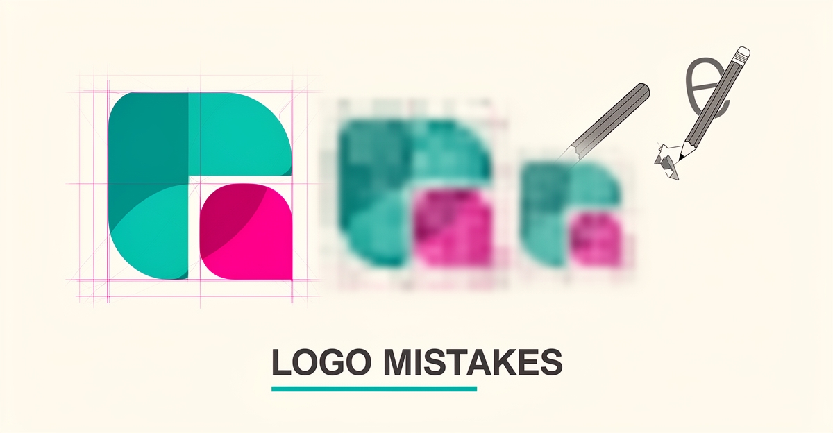
Key facts
- ASF Creative identifies eight core logo design pitfalls to avoid in its logo mistakes guide.
- ImageWorks Creative confirms five overlapping logo mistakes in its common mistakes blog.
- ASF Creative claims more than 30 years of hands-on experience in print and production on its site.
- Kapa99 reports 12 years of experience and 4,000+ clients in its service profile.
- Practitioners recommend a five-second recall test to check logo memorability per ASF Creative guidance.
- Logo details disappear below 24px or in a favicon, signaling poor scalability according to ASF Creative.
WANT RESULTS LIKE THIS?
Imagine a system doing all of this for your local business — every day, without you.
We build local businesses a custom website with a team of AI behind it: every lead captured and followed up, new content published monthly,customers finding you on Google — live in 7 days.
- 85+ pages at launch
- Every lead followed up, automatically
- Your whole business on one screen
Starting Without a Brief Leads to Costly Rework
A logo that looks perfect on a screen can fail the moment it hits a van door, a work shirt, or a shopfront sign. That failure is almost always traceable to one missing step at the start: a clear brief about where and how the mark will live.
Designing without a brief or usage plan is a foundational mistake. Starting logo design without knowing where the logo must work — vans, uniforms, shopfronts — leads to rushed changes, extra cost, and logos that fail in real-world applications. As ASF Creative puts it, you wouldn't order signage without measuring the wall, yet plenty of logos get designed without knowing where they need to work.
The cost shows up later, not in the first draft. Production constraints are ignored until a batch of workwear has to be remade because fine linework won't embroider, or a full-color lockup loses contrast on vinyl. Practitioner guidance notes it's cheaper to adjust a stroke width in the design stage than to remake a batch of workwear.
Scalability suffers the same way. Logos must remain clear from tiny labels to billboards, requiring testing across dimensions during design. Without usage context, designers keep fine linework, thin type, and long taglines that collapse at small sizes.
A structured kickoff prevents that rework. AI Business Sites gathers usage context upfront in the kickoff questionnaire about the business, services, and customers. That brief-first approach mirrors the process experts recommend for avoiding misaligned designs.
Usage context that should be captured before any concepts start includes:
- Primary touchpoints: website header, storefront signage, vehicle wraps, uniforms and embroidery
- Production methods: vinyl cutting, large-format print, embroidery, single-color applications
- Size extremes: favicon and social avatar down to billboard and vehicle door
This is where a done-for-you design process adds value. With brief-first design and client approval before launch, the logo is tested for real-world use, not just screen aesthetics. The same principle that ASF Creative has applied with more than 30 years of hands-on experience in print and production is built into the workflow.
Service-side models reinforce the point. Kapa99 reports 12 years of experience and 4,000+ clients, highlighting how matching projects to specialists and dedicated project managers eliminates three rounds of revisions and it's still wrong.
A logo is not a decorative graphic; it represents the heart of your brand. A poorly designed logo can confuse potential customers and make your business appear less credible. Starting with where the logo must work keeps the design practical, consistent, and cost-effective from day one.
Overcomplication and Poor Scalability Kill Memorability
A busy trades owner can spot a good logo in a split second, but a cluttered one disappears the moment it shrinks. Overcomplication and poor scalability are the fastest ways to lose memorability, and they cost real money when the mark fails on vans, uniforms, and a phone screen.
Excessive detail, thin lines, and complex symbols overwhelm audiences and reduce recall. ImageWorks Creative identifies overcomplication as a core pitfall, noting that too many effects or concepts hurt memorability and fail at small sizes. ASF Creative, with more than 30 years of hands-on experience in print and production, warns that complexity doesn't just hurt aesthetics, it increases production cost.
Scalability failures show up everywhere a logo must live. Fine linework and long taglines forced into a lock-up become illegible on labels and social avatars. Thin type also breaks down in embroidery and vinyl cutting. The practical fix is a logo system with primary, simplified small-size, and one-color versions tested across dimensions.
The five-second recall test is a pre-approval check practitioners recommend. Show the logo for five seconds, hide it, and ask what the viewer remembers. If the name cannot be read instantly, the type is too thin, too condensed, or too clever. This simple test exposes the detail that will not survive real use.
Production constraints make overcomplication expensive for local businesses. It is cheaper to adjust stroke width in the design stage than to remake a batch of workwear. Designing only in RGB or without black-and-white versions creates inconsistency across print materials.
A structured, brief-first process prevents these mistakes. AI Business Sites covers common logo pitfalls in the Building Your Website > Design & Content category and mirrors the research guidance: start with a clear usage plan, test across sizes and formats, and approve before launch.
Signs a logo is overcomplicated and unscalable:
- Details disappear below 24px or in a favicon
- Thin strokes blur in embroidery, vinyl, or low-res print
- The mark needs color to be recognizable
- Viewers cannot recall the name after a five-second glance
Simplicity is the proven solution for memorability. A good logo is distinctive, readable at small sizes, simple and memorable, and works across applications. Clean, scalable vector-based delivery keeps the mark consistent from shopfront to mobile, which aligns with a done-for-you design process that tests, simplifies, and approves before the site goes live.
Local business: doing this the old way?
One system replaces the whole pile.
All of it — the website, the follow-up, the content, the leads — built and run for you for $1,497 + $497/mo. Month-to-month, and you own everything.
See what your build includesTypography, Color, and Production Constraints Are Often Overlooked
A logo that looks perfect on screen can fall apart on a work van, a stitched uniform, or a faxed invoice. The most overlooked logo mistakes happen after the design looks "done" — in the typography, the color choices, and the realities of physical production.
Typography is where many logos quietly fail. Common errors include using too many fonts, poor kerning, thin strokes that vanish at small sizes, and trendy or unlicensed fonts that undermine professionalism. ASF Creative puts it bluntly: "If you can't read the name instantly, your type is too thin, too condensed, or too clever" (source). Wrong font choices also send mixed messages about your brand, according to ImageWorks Creative, which recommends aligning type with industry norms and audience expectations.
Color mistakes are just as common. Designing only in RGB — the color space of screens — causes inconsistency across printed materials, alongside problems like using too many colors, poor contrast, and lacking black-and-white versions (ASF Creative). A logo that only works in full color will look wrong on a single-color stamp, a receipt, or an etched glass door.
Production constraints are the most distinctive blind spot. Ignoring how a logo will be embroidered, vinyl cut, or printed in large format produces logos that are technically fine but practically flawed and expensive to reproduce. As ASF Creative notes, "It's cheaper to adjust a stroke width in the design stage than to remake a batch of workwear" (source). For trades and local service businesses, that cost lands directly on uniforms, vehicle wraps, and signage.
Preventing these issues means designing with real-world applications in mind from the start:
- Test typography for instant readability at small sizes, not just on a large monitor
- Create a black-and-white variant before approving the color version
- Check contrast and limit the color palette to what prints reliably
- Consider embroidery, vinyl, and large-format print before finalizing stroke widths and detail
This is where a structured process makes the difference. At AI Business Sites, design work includes print-aware reviews and black-and-white variants so a logo stays consistent across every material — from the website to the shopfront. It's the same principle behind our broader build process: a clear brief, structured review, and client approval before anything goes live. You can book a free strategy call to talk through your brand and website needs — no obligation, no long-term contracts.
Avoiding Trends and Generic Design Builds Long-Term Recognition
Chasing the latest design trend might make a logo feel fresh today, but it often becomes outdated tomorrow. As noted by industry experts, trendy designs quickly lose relevance, while templates and stock icons sacrifice long-term recognition by blending a business into the crowd. If your logo looks like ten others in your area, you've paid for camouflage, undermining the very purpose of a brand mark: to stand out and be remembered.
Generic design also fails the test of time because it lacks a foundation in the business’s unique identity. Without a clear brief guiding the process—detailing where the logo will appear, from uniforms to storefronts—designers risk creating something that looks acceptable on screen but fails in real-world use. You wouldn't order signage without measuring the wall, yet plenty of logos get designed without knowing where they need to work, leading to costly revisions and inconsistent branding.
A custom, brief-driven approach prevents these pitfalls by anchoring the design in strategy rather than style. At AI Business Sites, the logo emerges from a structured kickoff that captures the business’s services, audience, and applications—ensuring the mark works across all touchpoints. This process prioritizes distinctiveness over decoration, building a logo that earns recognition through consistency, not chasing fleeting aesthetics. Over time, that clarity becomes the brand’s most valuable visual asset.
Frequently Asked Questions
Why does my logo look great on screen but fail on vans or uniforms?
How can I tell if my logo is too complicated to remember?
What’s the biggest cost mistake with logo typography and color?
Do I really need a black-and-white version of my logo?
Is using a trendy logo or template going to hurt my business long term?
How do I make sure my logo works from a favicon to a billboard?
A Logo That Works as Hard as You Do
The pattern across every mistake we've covered is clear: logos fail when process is skipped. Starting without a brief, overcomplicating the mark, ignoring typography and print realities, and chasing trends all come back to the same root cause — designing without knowing where the logo has to live. The fix is just as consistent: capture usage context upfront, test across sizes and formats, and approve before anything goes live. That's exactly how we approach design at AI Business Sites — a structured kickoff, print-aware reviews, black-and-white variants, and your approval before launch, so your logo works on a van door as well as it does on a screen. If you're building or refreshing your brand, start with a simple self-check: run the five-second recall test, view your mark at favicon size, and confirm it holds up in a single color. If it doesn't, it's cheaper to fix now than after a batch of workwear is printed. And if you'd rather have the whole process handled — logo, website, and everything behind it — book a free strategy call. No obligation, no long-term contracts, just a real conversation about what your business needs.
FOR local businesss — BUILT AND RUN BY US
Your website. Your content. Your leads. Your data.
$500 starts your build. Seven days later it's live — chat, booking, follow-up, and your Google presence all set up. Then we run it, every month. You do the work you actually get paid for.