
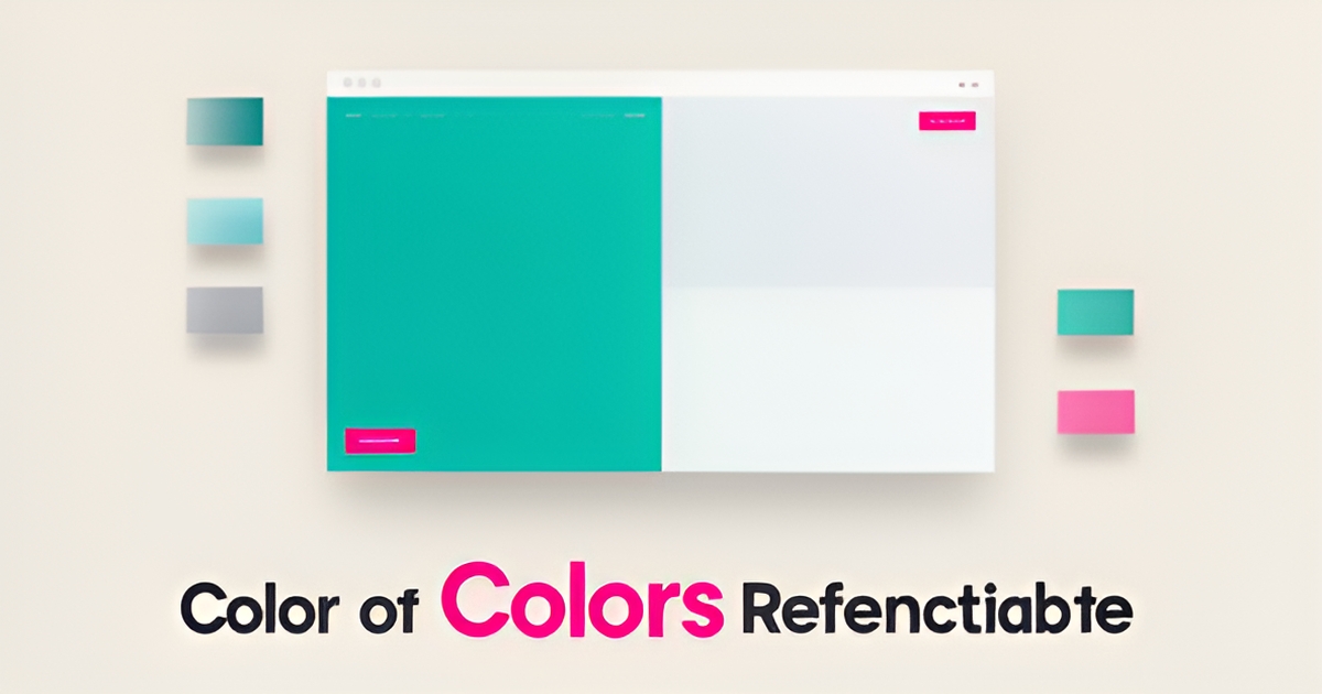
Key facts
- Most professional websites use three main colors according to Elementor
- The 60-30-10 rule allocates 60% primary, 30% secondary, and 10% accent color per Flux Academy
- AI Business Sites applies balanced palettes automatically across 85+ launch pages as per Elementor's guidance
- WCAG recommends 4.5:1 contrast ratio for normal text and 3:1 for large text per UI/UX literature
- Dark grey #333333 is preferred over pure black for body text to reduce eye strain per Elementor
- Accent color should appear only on CTAs, links, and buttons to maintain conversion power per Elementor
- AI-powered tools like Coolors generate theory-based palettes and check contrast automatically per Coolors
WANT RESULTS LIKE THIS?
Imagine a system doing all of this for your local business — every day, without you.
We build local businesses a custom website with a team of AI behind it: every lead captured and followed up, new content published monthly,customers finding you on Google — live in 7 days.
- 85+ pages at launch
- Every lead followed up, automatically
- Your whole business on one screen
The Color Overload Problem
Too many colors on a website create visual noise that overwhelms visitors and weakens brand recognition. Research shows that excessive palettes make navigation harder and dilute the psychological impact of strategic color choices, turning a designed experience into a confusing distraction. This is a common DIY mistake that costs leads by disrupting user flow and reducing trust.
A limited, intentional palette is essential for clarity and conversion. Most professional websites use three main colors, following the 60-30-10 rule where the dominant color covers about 60% of the design, secondary colors 30%, and accent colors 10% to create visual hierarchy and balance. This approach ensures that key elements like call-to-action buttons stand out without competing for attention.
When color schemes lack consistency, users struggle to distinguish between interactive elements and static content, increasing cognitive load and frustration. Best practices warn that having too many colors on a website can be overwhelming and distracting, advising instead to choose a limited palette and apply it consistently throughout the site to maintain usability and brand coherence.
AI Business Sites builds automated, balanced palettes into every site using AI-assisted tools that generate theory-driven combinations and preview them in real designs before publishing. This ensures that color supports legibility, guides user attention, and reinforces brand identity across all 85+ launch pages — turning a potential weakness into a silent conversion advantage.
The Research-Backed Standard: Three Main Colors
If you've ever wondered how many colors your website should have, the answer from design authorities is remarkably consistent: three main colors. This isn't arbitrary. It's a framework that balances visual appeal with usability, and it's how professional sites create hierarchy, guide attention, and build trust.
According to Elementor's design guidance, most professional websites use three main colors distributed through the 60-30-10 rule: 60% dominant color, 30% secondary, and 10% accent. This proportion creates balance and visual comfort, making it easier for visitors to process your content without feeling overwhelmed. Flux Academy echoes this approach, recommending a structured process where you choose a primary color based on psychology and context, add a secondary color for support, and finish with an accent for emphasis.
The three-color framework works because it establishes clear visual hierarchy. Your primary color anchors the brand and appears most frequently. The secondary color supports navigation and content structure. The accent color — used sparingly at roughly 10% — draws the eye to calls-to-action, buttons, and critical links. The Interaction Design Foundation explains that this distribution helps guide users toward key points on the page, improving both usability and conversion.
Color communicates before content. The moment someone lands on your site, your palette sets expectations and influences how they perceive your brand. Figma's resource library notes that color schemes can transform a simple design into a captivating experience, encouraging engagement and action. Cool tones like blue signal trust and professionalism, which is why they're common in finance and healthcare. Warm hues like red and orange evoke energy, making them effective for food and entertainment brands.
Here's how the three-color system breaks down in practice:
- Primary color (60%) — your brand's dominant shade, used for backgrounds, headers, and core identity
- Secondary color (30%) — supports navigation, content sections, and visual structure
- Accent color (10%) — highlights CTAs, links, buttons, and critical interactive elements
Contrast and accessibility are non-negotiable. WCAG standards recommend a contrast ratio of at least 4.5:1 for normal text and 3:1 for large text to ensure readability for all users. Many designers prefer dark grey (#333333) over pure black for body text on white backgrounds, as it reduces eye strain while maintaining legibility, according to Elementor.
While tools like Coolors allow palettes of up to 10 colors, the consensus is clear: restraint wins. Design best practices warn that too many colors overwhelm and distract users. The goal is a limited, purposeful palette applied consistently across every page.
At AI Business Sites, this principle is built into every website we create. Our AI implements balanced, three-color palettes automatically, ensuring your site looks professional, guides visitor attention, and meets accessibility standards — without you having to think about hex codes or contrast ratios.
How to Pick the Right Three Colors for Your Business
Most professional websites don't win on color variety — they win on color discipline. According to Elementor's color scheme guide, most professional websites use three main colors, balanced with a simple distribution rule that keeps the design feeling intentional rather than chaotic.
That's why a three-step selection process works so well for small business owners. It turns a vague aesthetic decision into a structured choice grounded in psychology and usability.
Step 1: Choose a primary color based on your industry. Your primary color appears most often on screen and is most strongly tied to your brand, so it should match the emotional expectation of your market. Figma's resource library categorizes this clearly: cool schemes — blues especially — signal calmness, intelligence, and dependability, making them ideal for finance, technology, and healthcare (think IBM, Microsoft, PayPal). Warm hues like red, orange, and yellow evoke energy and passion, which is why food, entertainment, and home goods brands like Chipotle and Etsy lean on them. Minimal neutral palettes of whites, grays, and soft pastels suit brands built on elegance and simplicity.
Step 2: Add a secondary color for balance. Your secondary color supports the primary and fills roughly a third of the page. Flux Academy's ultimate guide to choosing colors recommends a structured three-step approach exactly like this: primary first, then secondary colors chosen from a defined color scheme (complementary, analogous, triadic, and so on).
Step 3: Pick a high-contrast accent for actions. This is your conversion color. A bright, high-contrast accent pulls attention to call-to-action buttons, form submissions, and special offers — strategic contrast like cool blues against warm oranges is what makes buttons impossible to miss.
Once you have your three colors, apply the 60-30-10 rule: roughly 60% primary, 30% secondary, 10% accent. This guideline, cited by both Flux Academy and ixdf.org's UI color research, creates balance and visual comfort across the page.
Accessibility is the non-negotiable final check. Text and background pairs should meet a WCAG contrast ratio of at least 4.5:1 for normal text and 3:1 for large text. And skip pure black on pure white — many designers prefer dark grey #333333 for body text because pure black can cause eye strain.
The good news: you don't have to eyeball any of this. AI palette tools like Coolors now generate theory-based palettes and check contrast ratios automatically, and at AI Business Sites, balanced palettes are applied automatically across every page of your build — so the colors stay consistent site-wide without you touching a design tool.
Local business: doing this the old way?
One system replaces the whole pile.
All of it — the website, the follow-up, the content, the leads — built and run for you for $1,497 + $497/mo. Month-to-month, and you own everything.
See what your build includesHow AI Business Sites Automates Balanced Palettes
AI Business Sites builds balanced color palettes into every website at launch, eliminating manual color management entirely. The system defines a limited palette using semantic global colors — Primary, Secondary, Text, and Accent — applied consistently across all 85+ pages to ensure brand cohesion from day one. This approach aligns with research showing most professional websites use three main colors and follow the 60-30-10 rule for visual balance according to Elementor.
AI-generated featured images are automatically styled to match the brand palette, reinforcing visual consistency across blog posts, service pages, and comparison guides. Every image undergoes automated contrast validation to meet WCAG standards, ensuring text remains legible for all users as emphasized by UI/UX literature. The platform enforces the 60-30-10 distribution without requiring owner input — Primary covers ~60% of the design, Secondary ~30%, and Accent ~10% for CTAs and highlights.
This done-for-you design system removes guesswork and inconsistency, delivering a polished, accessible site that guides user attention and supports brand recognition. By embedding color theory into the build process, AI Business Sites ensures every page feels intentional and cohesive — no palettes to manage, no drift over time, just a professionally balanced foundation that works from launch.
Quick Checklist: Is Your Palette Working?
Before you publish another page or add another color, run this five-point audit. It takes less than ten minutes and reveals whether your palette is working for you or against you.
1. Count your main colors. Open your homepage and list every color that appears more than once. If you find more than three main hues, you are likely diluting your brand impact. Most professional websites use three main colors to maintain clarity and recognition. When we build sites at AI Business Sites, we lock this palette at the system level so every page inherits the same three-color structure automatically.
2. Check your 60-30-10 distribution. Your dominant color should cover roughly 60% of the visual space, your secondary 30%, and your accent just 10%. This foundational guideline creates balance and visual comfort. If your accent color appears everywhere, it stops working as an accent.
- Primary color: 60% of visual real estate
- Secondary color: 30% of visual real estate
- Accent color: 10% of visual real estate
3. Reserve your accent for CTAs only. Your accent color should appear exclusively on call-to-action buttons, important links, and form submissions. Strategic contrast pulls the eye exactly where you want it. If your accent color shows up in backgrounds or body text, it loses its power to convert.
4. Verify contrast meets WCAG standards. Text must maintain a contrast ratio of at least 4.5:1 for normal text and 3:1 for large text. Also check that you are using dark grey rather than pure black on white backgrounds to reduce eye strain. Our platform runs these checks automatically on every color pairing before anything goes live.
5. Confirm consistency across all pages. Click through your service pages, blog posts, and contact forms. Do the same buttons look the same everywhere? Inconsistent color use confuses visitors and weakens brand recognition. We define colors once in a central design system and apply them globally across all 85+ pages we build, so your brand never drifts.
If your site fails more than one of these checks, you are likely losing conversions to visual confusion. Start your build with AI Business Sites and get a palette that passes every test from day one.
Frequently Asked Questions
How many colors should I actually use on my business website?
Why is using too many colors on a website a problem?
What is the 60-30-10 rule in website color design?
How do I choose the right three colors for my industry?
Does AI Business Sites automatically apply a balanced color palette to my website?
How can I check if my website’s color palette is working effectively?
Why Three Colors Work Harder Than Ten
A focused three-color palette—guided by the 60-30-10 rule—creates visual harmony, strengthens brand recognition, and directs attention to what matters most: your calls to action. When colors are chosen with intention and applied consistently, your website becomes a clearer, more trustworthy experience that supports conversion instead of undermining it. AI Business Sites builds this discipline into every launch, automating balanced, accessible palettes across all 85+ pages so you never have to manage hex codes or contrast ratios yourself. If you're ready to replace guesswork with a design system that works silently in your favor, book a free strategy call to see how it looks for your business.
FOR local businesss — BUILT AND RUN BY US
Your website. Your content. Your leads. Your data.
$500 starts your build. Seven days later it's live — chat, booking, follow-up, and your Google presence all set up. Then we run it, every month. You do the work you actually get paid for.