
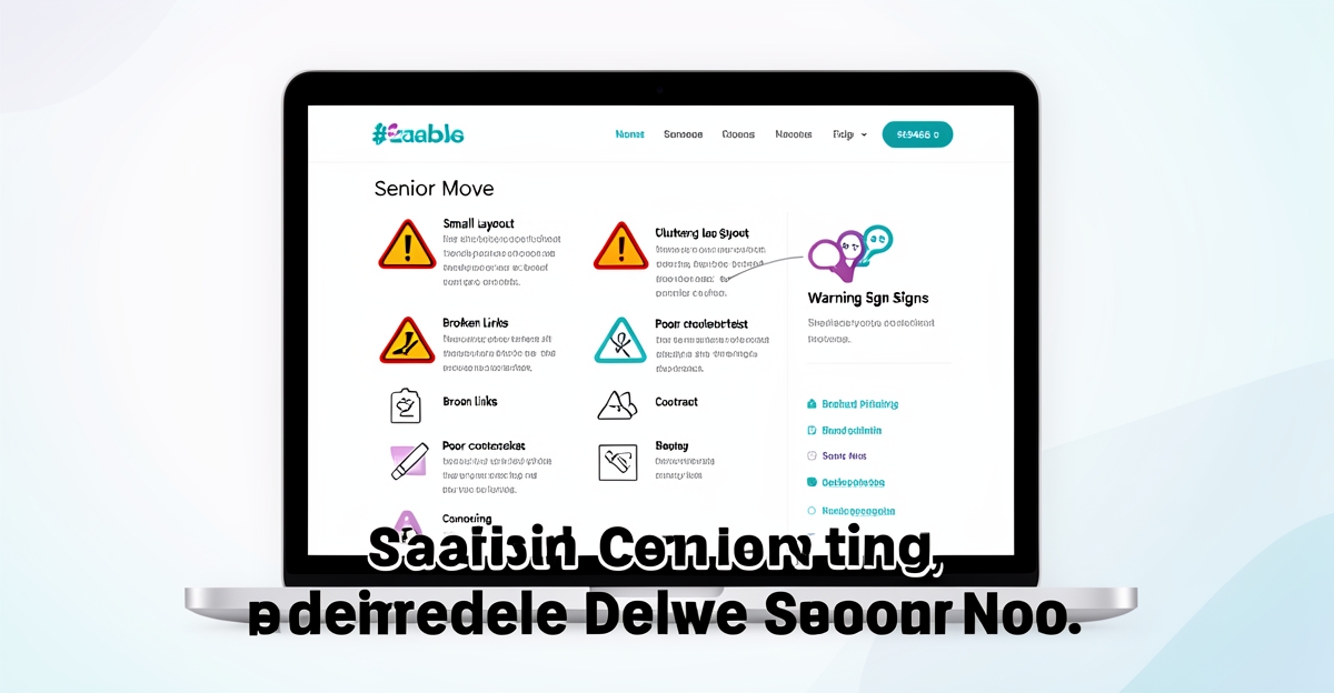
Key facts
- 90% of Americans aged 65+ are internet users according to Slingshot/Circa46.
- Vision decline starts in the early 40s, necessitating font sizes of at least 16px for readability as recommended by accessibility experts.
- 75% of adults aged 55+ prefer aging in place per DosePacker’s senior living trends report.
- One-third of all U.S. homeowner households are headed by someone aged 65+ as highlighted by AgeInPlaceTech.
- Seniors require WCAG AA compliant contrast ratios of at least 4.5:1 for comfortable text readability as stated by Slingshot/Circa46.
WANT RESULTS LIKE THIS?
Imagine a system doing all of this for your local business — every day, without you.
We build local businesses a custom website with a team of AI behind it: every lead captured and followed up, new content published monthly,customers finding you on Google — live in 7 days.
- 85+ pages at launch
- Every lead followed up, automatically
- Your whole business on one screen
Why Senior Move Websites Lose Clients Before They Call
The senior market isn't niche — it's the market. 90% of adults 65+ are online, 75% want to age in place, and one-third of all homeowner households are headed by someone 65+. These aren't future customers. They're searching right now for downsizing help, relocation coordination, and estate clearance — and most move company websites stop them cold.
The problem isn't lack of demand. It's that most sites weren't built for how older adults actually use the web. Vision decline starts in the early 40s, making small text and low contrast genuine barriers. Motor control changes from arthritis or reduced dexterity turn drop-down menus and tiny tap targets into frustration. Cognitive processing speed slows, so dense paragraphs and unclear next steps create decision paralysis. Research on senior-friendly design confirms these aren't preferences — they're accessibility requirements that directly determine whether a visitor completes a task or leaves.
- Text smaller than 16px with insufficient contrast ratios
- Multi-level navigation requiring precise mouse control
- Dense content blocks without visual hierarchy or numbered steps
- Vague service descriptions with no pricing transparency
- Mobile layouts that hide contact options or break booking flows
Each of these is a documented barrier to task completion for older users. AI Business Sites builds every website on a mobile-first Next.js foundation that bakes senior-friendly design in by default — scalable type, high contrast, flat navigation, sequential content structure, and sticky click-to-call CTAs. The AI content engine then generates service and location pages in the "bite-sized," FAQ-rich format seniors need to move forward. The result: a site that doesn't just look professional — it converts the largest, wealthiest, most digitally active senior population in history.
Red Flag 1: Text Too Small and Contrast Too Low to Read
Red Flag 1: Text Too Small and Contrast Too Low to Read
As the U.S. senior population grows, with projections indicating an increase from 350 million in 2026 to 372 million by 2055, ensuring website accessibility is crucial. A significant barrier for seniors on senior move company websites is text that is too small and lacks sufficient contrast, hindering readability. Research highlights that vision decline begins in the early 40s, and by 75+, most users require high contrast, scalable text, and zero reverse type or text over patterns to navigate websites comfortably.
The Statistics Behind the Struggle
- Minimum Font Size: While a minimum of 12-14 point font size is recommended for seniors, accessibility experts emphasize the importance of at least 16-point font size for optimal readability (NonProfit PRO).
- Vision Decline Onset: Adults start experiencing vision decline in their early to mid-40s, particularly with close-distance tasks (NonProfit PRO).
- Contrast Requirement: Strong contrast between text and background is essential, with a recommended WCAG AA contrast ratio of 4.5:1 or higher (Slingshot/Circa46).
The Impact on Senior Move Companies
Seniors are highly active online, with 90% of Americans aged 65+ being internet users (Slingshot/Circa46). However, small text and low contrast can lead to frustration, increased cognitive load, and ultimately, abandoned bookings. Given the preference for aging in place (75% of adults aged 55+, DosePacker), senior move companies must ensure their websites cater to this demographic's needs to capitalize on the demand for downsizing, relocation, and home modification services.
AI Business Sites’ Solution
AI Business Sites addresses this red flag through its Next.js design system, which enforces:
- 16px+ base font sizes by default, ensuring readability.
- 4.5:1 contrast ratios for clear text visibility.
- Rem-based scaling for effortless text size adjustment.
Every service page is designed to be readable without zooming, providing a seamless experience for seniors. This approach not only enhances usability but also contributes to improved on-page SEO by ensuring content is accessible and crawlable by search engines.
Key Takeaway
To avoid losing bookings due to basic accessibility oversights, senior move companies must prioritize senior-friendly design principles. By incorporating larger, scalable text and high contrast ratios, businesses can significantly improve the user experience for their target audience.
- Ensure a minimum font size of 16px for all core content.
- Maintain a WCAG AA compliant contrast ratio of at least 4.5:1.
- Use rem units for scalable text to accommodate user preferences.
By addressing this foundational accessibility issue, senior move companies can set the stage for a more inclusive and effective online presence, aligning with the broader trend of technology adoption in senior living and the need for seamless digital experiences (Compass Associates). AI Business Sites' integrated approach ensures that every website is not just visually appealing but also fully functional and accessible, ready to convert visitors into bookings.
Red Flag 2: Navigation That Requires Precision Seniors Don't Have
Many senior move websites force users to navigate through layered drop-down menus or click tiny buttons that demand steady hands and sharp eyes. For seniors with arthritis, tremors, or reduced dexterity, these interactions become frustrating barriers rather than helpful pathways. Research confirms that motor control limitations directly affect mouse manipulation, making precision-based navigation a significant obstacle for older adults online.
To accommodate these physical challenges, websites need navigation designed for accessibility from the start. Seniors benefit from keyboard arrow key navigation, obvious links with strong visual contrast, and larger single-click buttons that maximize clickable areas. Experts recommend a minimum touch target size of 44x44 pixels with ample spacing between elements to prevent accidental taps. These adjustments aren’t just considerate—they’re essential for enabling independent use.
AI Business Sites builds navigation that meets these standards by default. The platform uses flat, single-click menus built with mobile-first React components, ensuring every primary page is reachable in one tap or keystroke. Keyboard-first focus states are implemented across all interactive elements, allowing users to navigate without a mouse. Touch targets are sized and spaced to exceed accessibility guidelines, reducing errors for users with limited motor control. This approach removes friction from the journey, keeping the focus on finding information and taking action—not fighting the interface.
By eliminating precision-dependent interactions, senior move websites built on this foundation become usable for a wider audience. Clear, accessible navigation supports task completion, which directly impacts booking rates. When visitors can move through a site confidently, they’re more likely to engage with services and convert into leads. This isn’t about adding features—it’s about removing barriers that silently drive potential clients away.
Accessible navigation isn’t optional—it’s a prerequisite for inclusive design that respects how real people interact with technology. When websites accommodate physical limitations without sacrificing clarity or function, they create experiences that work for everyone, regardless of age or ability. For senior move companies, this means fewer abandoned visits and more completed bookings, starting with a navigation system that doesn’t demand perfection from its users.
Red Flag 3: Dense Content Blocks That Overwhelm Decision-Making
Seniors are online now more than ever—90% of Americans 65 and older use the internet—but that doesn’t mean they can process dense, unstructured content. When a website buries key details in long paragraphs, it forces older visitors to work harder than necessary to find answers. Cognitive decline slows information processing, making it tougher to follow multi-step instructions or scan for critical details at a glance. A single dense paragraph can feel like trying to read a contract, leaving visitors overwhelmed before they even reach the contact form.
The fix is simple: break information into “bite-sized” sequential steps. Short sentences, descriptive subheads, and clear next actions at every scroll level help seniors—and anyone else—digest what they need without straining. AI Business Sites’ AI content engine structures service pages this way by default, turning complex moves into clear progressions like “Step 1: Free Consultation → Step 2: Custom Plan → Step 3: Move Day.” FAQ sections are baked in at the end, making every page easy to scan and act on.
Here’s what a senior-friendly content layout looks like in practice:
- Short paragraphs (2–3 sentences max) that avoid jargon and focus on what matters to the visitor.
- Descriptive subheads that act as mini roadmaps—no guessing what the next section covers.
- Numbered steps that guide visitors through the process without leaving them to piece together scattered details.
- Clear next actions after every section—“Call Now,” “Get Your Free Quote,” or “Next Step” buttons—so visitors always know what to do.
When content is cluttered and unstructured, seniors leave. When it’s clear and sequential, they stay—and book.
Local business: doing this the old way?
One system replaces the whole pile.
All of it — the website, the follow-up, the content, the leads — built and run for you for $1,497 + $497/mo. Month-to-month, and you own everything.
See what your build includesRed Flag 4: Vague Services and Hidden Pricing That Erode Trust
Seniors and their adult children research move services online with one goal: knowing exactly what to expect before they commit. When a website buries pricing or uses vague service descriptions like “senior moving help,” visitors hit an immediate trust wall. Research shows 90% of Americans 65+ are online, yet older adults and Gen Xers have zero tolerance for poor mobile experiences—especially when every click feels like a guessing game. For move companies, clarity isn’t optional—it’s the difference between a booked move and a lost lead.
Vague services erode trust by forcing visitors to call instead of converting on the spot. Instead of “we handle moves,” seniors need distinct pages that spell out:
- Downsizing support — tailored to empty nesters reducing space
- Senior community relocation — seamless moves to assisted living or retirement communities
- Estate clearance — sensitive handling of family heirlooms and memorabilia
- Packing and unpacking support — whether full-service or DIY assistance
Every service page must include transparent pricing ranges, step-by-step timelines, and an FAQ section built for voice search. Adult children—often the primary decision-makers—rely on quick answers, not marketing fluff. A study on digital expectations confirms that Gen Xers and Millennials expect predictive, personalized experiences—meaning your site should anticipate their questions before they ask.
AI Business Sites builds this clarity into every move company website from day one. Each client site launches with 60 SEO service-and-location pages—automatically generated with pricing ranges, process steps, and voice-search-optimized FAQs tailored to the business’s actual services. No manual guesswork, no filler text. Just clear, trust-building pages that answer every question seniors and their families have before they pick up the phone.
Red Flag 5: Mobile Layouts That Break the Booking Flow
Most seniors have already gone online—90% of Americans 65+ now use the internet, and their adult children researching on their behalf won’t tolerate poor mobile experiences. Yet many senior move websites still lose leads the moment a visitor lands on their phone. A sticky booking button that disappears on scroll, a booking form that spans three pages, or no tap-to-call option at the top of the screen can turn intent into abandonment instantly.
Smartphones are now the primary way older adults stay connected. According to the same research, most older adults own at least one smart device, and Gen X or Millennial decision-makers expect mobile-first workflows that mirror apps they use daily. When a site lacks a persistent “Get a Quote” button, a single-page form, or a click-to-call link, the friction pushes visitors to close the tab instead of booking the move.
Mobile-first design isn’t optional—it’s the difference between a booked job and a lost lead. AI Business Sites builds every site with a Next.js mobile-first architecture, where the booking flow stays visible no matter how far a visitor scrolls. The Cal.com integration enables one-tap scheduling directly from the page, while a sticky “Book Now” button remains fixed at the bottom of the screen on every device. For phone leads that arrive after hours, the optional AI voice agent ($199/month) answers calls, captures details, and even books appointments—turning every ring into a real lead without anyone lifting a finger.
How to Fix All Five Without Rebuilding From Scratch
How to Fix All Five Without Rebuilding From Scratch
You don’t need to tear down your current website to make it senior-friendly. Each of the five red flags identified in the research can be resolved through targeted, on-page improvements that align with accessibility best practices and local SEO principles. Start by enforcing a minimum 16px base font size with WCAG AA contrast ratios — research shows vision decline begins in the early to mid-40s, and seniors require strong text-to-background contrast to read comfortably. Replace complex drop-down menus with flat, single-click navigation that supports keyboard arrow key use and features 44x44px touch targets, addressing motor control limitations that affect mouse precision. Restructure dense content into bite-sized, sequential steps using short paragraphs, descriptive subheads, and numbered lists — cognitive decline impacts the ability to process long blocks of text, so clarity and flow are essential for task completion. Create dedicated service pages for each move type (e.g., downsizing, estate clearance) with transparent pricing ranges and FAQ-rich sections; seniors need descriptive titles and focused content to build trust and reduce uncertainty. Finally, implement a mobile-first responsive layout with a sticky “Get Free Quote” button and click-to-call functionality — 90% of Americans aged 65+ are internet users, and Gen X/Millennials have no tolerance for poor mobile experiences, making streamlined actions critical across devices.
AI Business Sites bakes these fixes into every website by default. Built on a mobile-first Next.js foundation, the platform generates 85+ pages within 30 days using an AI content engine that structures service and location pages in senior-friendly formats — clear, sequential, and FAQ-rich — while automatically applying accessible typography, contrast, and navigation standards. The built-in CRM and booking system capture leads from web forms, voice calls, and chat, with an AI voice agent handling after-hours inquiries. Clients own their code, content, and domain, eliminating vendor lock-in. By consolidating website, CRM, automation, content generation, newsletter, project management, and document tools into one system, AI Business Sites replaces 8–10 separate subscriptions. This isn’t a retrofit — it’s senior-friendly design engineered into the core, so your site launches accessible, conversion-ready, and ready to rank. To see how it works for your business, get a free site audit or schedule a live demo.
Frequently Asked Questions
Why do so many senior move websites have trouble getting bookings from older adults?
What’s the biggest mistake senior move companies make on their websites?
How does navigation on most senior move websites frustrate older visitors?
Why do seniors get overwhelmed by the content on many move company websites?
Do seniors actually care about pricing transparency on move company websites?
Is mobile-friendly design really that important for senior move companies?
How can a senior move company fix these issues without rebuilding their entire website?
What happens when a senior move website ignores these accessibility issues?
Why is senior-friendly design a business opportunity for move companies?
Turn Senior Online Traffic Into Bookings: Fix These 5 Website Flaws Before Your Competitors Do
The senior market isn’t a niche—it’s the fastest-growing, most digitally active opportunity in home services today. With 90% of adults 65+ online and three-quarters prioritizing aging in place, a poorly designed move company website isn’t just frustrating—it’s costing you real bookings. Small text, confusing navigation, overwhelming content, vague services, and clunky mobile layouts aren’t accessibility preferences; they’re barriers that silently drive potential clients away before they ever pick up the phone. The good news? Fixing these five red flags doesn’t require a full website rebuild. Start by enforcing 16px+ fonts with WCAG AA contrast, replacing drop-down menus with flat navigation, breaking dense content into clear step-by-step guides, creating dedicated service pages with transparent pricing, and ensuring mobile visitors can book or call with one tap. If you’d rather skip the trial-and-error, platforms like AI Business Sites bake these fixes into every custom build from day one, ensuring your website doesn’t just look professional—it converts the largest senior population in history. Ready to turn online traffic into booked moves? Get a free site audit or book a demo today.
FOR local businesss — BUILT AND RUN BY US
Your website. Your content. Your leads. Your data.
$500 starts your build. Seven days later it's live — chat, booking, follow-up, and your Google presence all set up. Then we run it, every month. You do the work you actually get paid for.